Digital Strategy Review | 2026
Browser AI Sidebars Are Eating Your Critical Buttons: A Frontend Pitfall I Encountered in Creem
By Uncle Fruit · 8 Min Read
Preface
It’s funny, really. I’ve been tinkering with the Creem payment backend for the past couple of days, and what held me up wasn’t the payment flow or permission issues, but a much more insidious frontend UX trap. The world is a makeshift operation, and I’m no exception; even a seasoned pro in the global market can trip over such a rookie mistake, looking every bit like an intern. As it turns out, the culprit was the GPT sidebar I keep pinned in my Atlas browser. Still, this frontend issue served as a wake-up call—I need to be more rigorous about standards when having AI handle frontend development. Here is what happened.
01
The Scene of the Crime: 10 Minutes of Missing Buttons
The most critical entry points on the product list page (the Share / ... / Edit action group) are usually positioned on the far right. When the window is wide, everything works fine. But once the Atlas sidebar is pinned, the available width is compressed, triggering the page’s responsive breakpoints and pushing the right-hand action area out of the viewport. I spent 10 minutes staring at the screen, cursing the Creem product manager and wondering if they’d lost their mind. It wasn’t until I closed the AI sidebar that I realized the truth. It wasn’t the product manager’s fault—it was the frontend developer cutting corners.
Looking back, the essence of this problem is: critical actions lacked a “visibility fallback.”
In many backends, to keep things “tidy,” the table container is often set to overflow-x: hidden, or it allows scaling but fails to provide horizontal scrolling. The result is that the buttons are still in the DOM, but they are completely invisible to the user and unreachable via interaction.
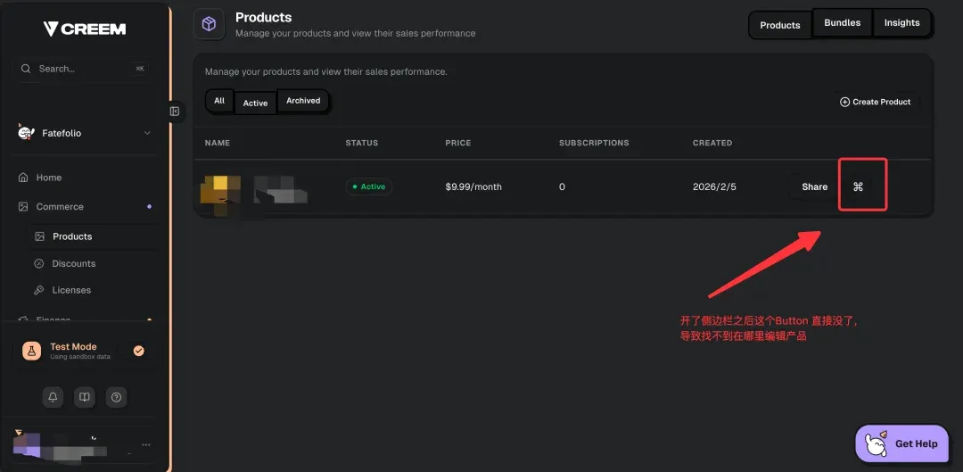
The danger here isn’t just that it’s “hard to use”; it creates false judgments. Users mistake “layout clipping” for “missing product features,” treating a UX issue as a system bug, which ultimately leads them to abandon the task. My own frontend experience is quite limited, so I don’t know if a senior developer would ever write code like this, but whoever wrote this for Creem certainly wasn’t senior—or they were just lazy, or the QA process was lazy.
02
Four Hard Standards for Avoiding Frontend Pitfalls
-
01 Critical action columns must be visible The Actions column should prioritize
position: sticky; right: 0;, with a background and shadow to ensure it remains clickable at narrow widths. -
02 Table containers must allow horizontal scrolling Use
overflow-x: autofor the outer layer; never usehiddendirectly. Ideally, provide a scroll indicator (a fade-out mask, hint text, or a scrollbar). -
03 Rearrange interactions for narrow screens; don’t force a squeeze At small widths, collapse actions into a “More (…)” menu for each row, but ensure the entry point always remains within the viewport.
-
04 Include “sidebar expansion width” in regression testing Use Playwright to run breakpoint screenshots and click test cases, focusing on three things: visibility, clickability, and the integrity of the interaction path.
03
The Bottom Line
Pinned AI sidebars are becoming the new normal. Frontend developers must account for display fallbacks—even if the layout breaks, the functionality must not.