By Mr. Guo · ~4,300 words · Reading Time / 12 Min · Updated / 2025-11-20
Foreword 🧭
The minute NanoBanana Pro launched, my instinct wasn’t to skim the spec sheet—it was to throw real-world demands at it and see whether it’s just another toy or a tool I can trust in production.
So I designed a stress test that mirrors the “daily grind” briefs we all get: fashion-magazine covers, photoreal macro shots, lifestyle photography, cyberpunk night scenes, and a set of image-to-image tasks most people care about—post-apocalyptic heroines fused into new environments. Treat this as an INTJ-style field note: no hype, no hate, just a simple question—can it pull a project from 0 to at least 0.7? That remaining 0.3 has always belonged to your taste. 🙂
📋 Highlights
- 01 Vogue-grade cover test: could you actually send it to print?
- 02 Photoreal macro, lifestyle, and neon cityscapes—where does the detail ceiling sit?
- 03 Post-apocalyptic heroine via img2img: character memory, lighting match, and 4K-wallpaper composition.
- 04 Where it shines, where to dodge, and practical tips for creators.
01. From Specs Back to the Canvas: How I Tested NanoBanana Pro
Most reviews open with architecture and dataset sizes. Useful, sure—but creators usually just want one sentence: “For my daily workload, how much time does this save me?” I deliberately kept the tests grounded in real production scenarios:
- Commercial print: high-end magazine cover layout, bilingual typography, composition stability.
- Photoreal shoots: jewel beetle macro, lifestyle coffee shot, to probe detail ceilings and skin texture.
- Cinematic worlds: rainy cyberpunk street, to test mood, density, and giant neon signage.
- Img2Img: wasteland heroine blended into new scenes—does it remember the character or slap on sticker vibes?
Full disclosure: my aesthetic chops are mediocre at best, so me “reviewing” an image model feels like moonlighting. But as a regular player, I still wanted to poke it the way a working creative would.
02. Four Text-to-Image Trials: From Vogue Covers to Neon Alleys
Test 01 · High-Fashion Magazine Cover
Prompt: high-end fashion cover layout, large red “设计” in the center, “DESIGN” beneath, white background, studio lighting, elevated typography.
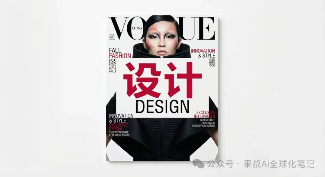
The result screams “magazine” at first glance: the massive red “设计” sits dead center, crisp strokes, no broken radicals. “DESIGN” below uses a clean sans-serif, flanked by English blurbs, delivering that unmistakable Vogue cadence—negative space, alignment, hierarchy all hold up. The smaller text is legible but, as with most models, still slips into pseudo-English gibberish here and there.
Verdict: If you’re a designer, it’s perfect for nailing layout, typographic pairing, and overall vibe. You can pin your idea fast, then swap the copy manually before going to print.
Test 02 · Jewel Beetle Macro
Prompt: iridescent carapace, water droplets, extreme detail, photoreal, National Geographic mood.
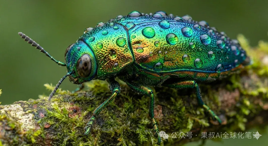
This one’s “save-as-wallpaper” material: the beetle shell shifts blue-green-gold with tiny droplets clinging to each bump. You can see pore-like textures on the surface—borderline trypophobia. Subject is razor sharp, background melts into painterly bokeh. Lighting direction stays consistent; reflections on the carapace match highlights on the branch—no chaotic light sources.
Verdict: For “realism + detail” work—KV, poster backdrops, nature IP concepts—NanoBanana Pro is production-ready. Tame the sharpness in post and it can walk into a commercial deck.
Test 03 · Lifestyle Coffee Close-Up
Prompt: close-up of a hand holding a coffee cup, “Pro User” written in black marker on the mug, shallow depth of field, café ambience.
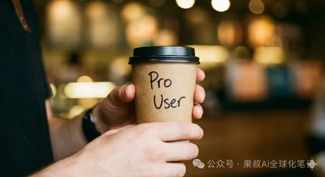
Skin texture, tone, and blood color all read natural—no uncanny 3D wax hand. “Pro User” is spelled flawlessly in casual marker script that fits the scene. Background has dreamy bokeh, warm lighting, soft silhouettes—basically an Instagram snap from your favorite corner café.
Verdict: For lifestyle, social content, or subtle brand placements, the “toy” feeling is gone. Short text control is miles better than older models; two to three English words rarely fail.
Test 04 · Rainy Cyberpunk Street
Prompt: rainy cyberpunk street, giant neon sign reading “NANOBANANA” in pink, wet reflections, cinematic, 8K finish.
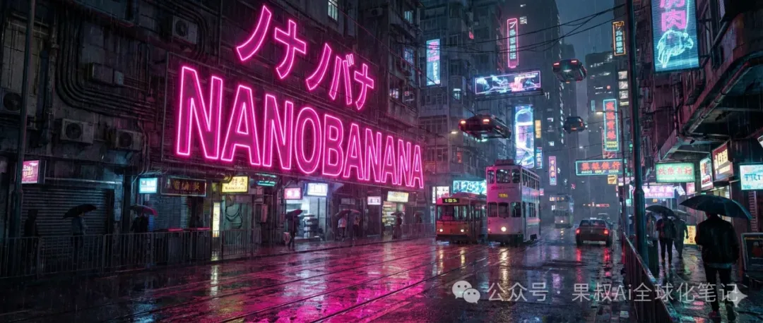
First glance feels like a film storyboard: deep blues and magentas, rain streaks, and a monolithic neon “NANOBANANA” glowing above a soaked alley. Reflections ripple correctly across puddles, signage stacks vertically with believable type, and atmosphere density sits in that Blade Runner sweet spot.
Verdict: Mood-driven environments are a safe bet. You can iterate on cinematic key frames without fighting the tool.
Quick recap of the text-to-image section:
· Compositions skew “safe but sophisticated,” so magazine-level layouts rarely need heavy tweaking.
· Photoreal scenes show clear advantages in lighting, material, and detail fidelity.
· Short-text control is stable enough for oversized typography—music to every designer’s ears.
03. Img2Img: A Wasteland Heroine That Actually Holds Together
I picked a post-apocalyptic heroine as the source image and asked NanoBanana Pro to re-stage her in a different wasteland environment. Here’s what stood out:
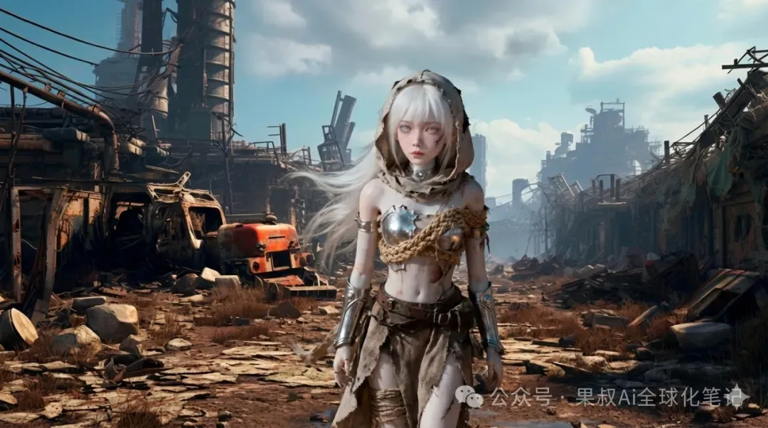
Observation 01 · Character Memory
White hair, hood, bandages, metal armor—every signature detail carried over. Face shape and attitude stayed consistent; no random face swaps. For anyone building a long-term OC or brand mascot, that continuity is crucial.
Observation 02 · Lighting & Material Match
The background uses strong side lighting with blue sky highlights. The character’s highlights and shadows line up, so she doesn’t look like a lazy PNG paste. Fabrics, rope, metal plates all show scratches, dust, and grit—rich detail without over-sharpening.
Observation 03 · Composition & “4K Wallpaper” Sense
The output is a wide composition: character slightly forward of center, environment breathing on both sides. Sky, distant structures, dusty ground—all loaded with info. Drop it onto an ultrawide monitor and it still feels intentional.
Img2Img Takeaways
For IP builders, NanoBanana Pro offers:
- A relatively painless way to craft full suites of world posters or wallpapers without the character derailing.
- Solid bases for merch key art—hand off to artists for polish instead of starting from blank.
- Consistent visual language across different settings (wasteland, alien planet, neon city).
- I haven’t yet stress-tested the rumored “14 reference images” superpower.
Bottom line: the model isn’t just for casual tinkering anymore—it can play a real role in character operations and worldbuilding.
04. Summary & Usage Tips: Where Does It Belong in the Stack?
Looking at all the tests, I’d call NanoBanana Pro “a multi-tool you can actually work with, not just a show-off toy.” Staying in true INTJ fashion, here’s the breakdown.
Where It Shines
- Wide style coverage: fashion covers, photoreal macros, lifestyle, cyberpunk, 3D wasteland—all achievable with stable quality.
- Large-type accuracy: big text like “设计,” “DESIGN,” “Pro User,” “NANOBANANA” lands correctly—poster and cover drafts are viable.
- Detail handling: beetle droplets, metal reflections, torn cloth, wet pavement reflections—all carry convincing finesse.
- Img2Img stability: balances character memory with scene lighting—faces don’t collapse, backgrounds aren’t ignored.
- Fast “usable roughs”: perfect as a rough/clean sketch generator to push projects from 0 to 0.7 quickly.
Mind the Gaps
- Tiny text remains dicey: small blurbs might read like English but are often gibberish—redo copy before final delivery.
- Default compositions are safe: for extreme angles or perspective, spell it out in the prompt; otherwise you’ll get “pretty but conservative.”
- Generate campaigns in a single run: to keep tone and grain consistent, craft series outputs within the same session/style block.
- It won’t replace taste: it expands possibility space, but that final “does this feel right?” call is still yours.
If you already design, shoot, or paint, NanoBanana Pro gets your ideas from 0 to 0.7. That last 0.3—your judgment, taste, and polish—remains irreplaceable.
Think of this as the “round-one hands-on.” If you want me to push it into architecture, print ads, UI, or other briefs, we can absolutely do a “pro-level field test” next.
Mr. Guo’s Indie Building & Growth Notes
AI Creation / Strategy / SaaS / Global Growth
“Good tools don’t think for you—
they give you more time to think about what truly matters.”
If this hands-on test gave you ideas, tap “Like” or share it so more creators evaluating image-model firepower can get some frontline signals.