Visual & AI Creation Review | Vol. 2025
Nanobanana Pro Hands-On Review:
From Vogue Covers to Wasteland Warriors, How Powerful Is It Really?
By Mr. Guo · ~4300 words · Reading Time: 12 Min · Updated: 2025-11-20
A Quick Note
When Nanobanana Pro launched, my gut reaction wasn’t to check spec sheets — it was to throw a bunch of real demands at it and see if it’s a toy or something that can actually handle production work.
So I designed a very “working professional daily life” stress test: fashion magazine covers, realistic macro shots, lifestyle photos, cyberpunk night scenes, plus the image-to-image capability many care about most — wasteland-style girl character + deep scene integration.
Think of this as an INTJ-style hands-on log: no hype, no hate, just seeing if it can help us get projects from 0 to at least 0.7. That remaining 0.3 has always belonged to your taste.
Key Highlights
- 01
Vogue-style magazine cover test: Can you print it directly?
- 02
Realistic macro, lifestyle, and cyberpunk street scenes — where are the “ceiling” details and atmosphere?
- 03
Wasteland girl image-to-image: How does it handle character memory, lighting match, and 4K wallpaper composition?
- 04
Which scenarios deserve deployment, which pitfalls to avoid? Usage tips for creators.
01
From Spec Sheets to Pictures: How I Tested Nanobanana Pro
Many reviews start stacking parameters, model architecture, training set sizes — lots of information, but what creators really want to know is usually one sentence: “For my daily work, how much time can it save me?”
So I deliberately designed this test to be very “grounded” — all around real work scenarios:
-
Commercial graphic design: High-end magazine cover layout, mixed Chinese-English text, testing composition and font stability.
-
Realistic photography: Jewel beetle macro, lifestyle coffee cup, testing detail ceiling and skin feel.
-
Cinematic scenes: Rainy night cyberpunk street, testing mood, complexity, and large-font neon signs.
-
Image-to-image: Wasteland-style girl character integrated into new scene, checking if it remembers the character and avoids “sticker effect.”
As someone with relatively weak aesthetics and design skills, reviewing image generation models feels a bit off-brand for me, but as a regular player-user, I still wanted to approach this with a “just playing around” mindset!
02
Four Text-to-Image Tests: From Vogue Covers to Cyberpunk Streets
Test 01 · High-End Magazine Cover
Prompt: High-end fashion magazine cover layout, large “设计” (Design) text in center, “DESIGN” below, white background, studio-shot texture, premium typography.
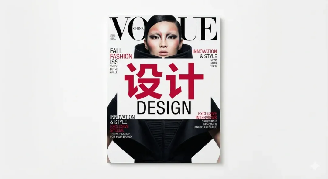
The output immediately looks “magazine”: the large red “设计” in the center is very eye-catching, character shapes are neat, strokes are clean, no common “radical drifting” accidents. The “DESIGN” below uses standard sans-serif, paired with the large headline above and small English titles on both sides, the whole thing has serious Vogue vibes — whitespace, alignment, hierarchy all on point. Small text is readable but still has some “looks like English but is actually made-up words” quirks, similar to most current models.
Conclusion: If you’re a designer, using it for cover composition, font pairing, and overall style direction is completely viable — you can quickly solidify the idea in your head; for print, just re-typeset the text content.
Test 02 · Jewel Beetle Macro
Prompt: Iridescent metal shell, water droplets, extreme detail, realistic, National Geographic style.
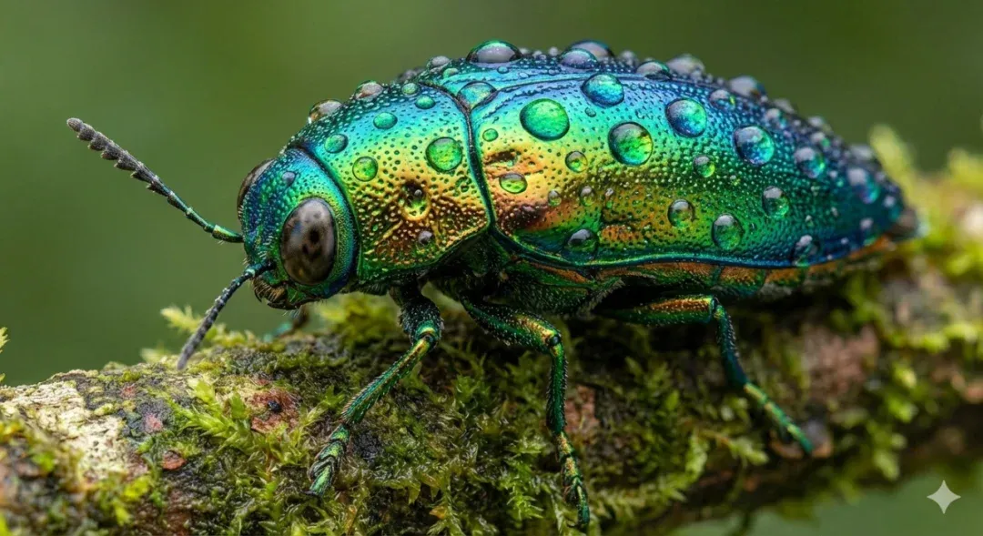
This one is the “can’t help but save as wallpaper” type: beetle shell has blue-green-gold gradient, each tiny bump holds micro water droplets, edges catching highlights. The shell surface even shows pore-like micro textures, so realistic it’s slightly trypophobia-inducing. Subject is sharp, background naturally blurs into color blocks — exactly like professional macro lens feel. Light direction is unified, shell reflections and branch highlights echo each other, no “light sources flying everywhere” disconnect.
Conclusion: In the “realistic + detail-obsessed” lane, Nanobanana Pro can directly be used for KV, poster bases, or nature IP concept art. Just tweak sharpness slightly in post, and it’s completely production-ready.
Test 03 · Lifestyle Coffee Cup
Prompt: Coffee cup close-up in hand, cup has “Pro User” written in black marker, depth-of-field blur, café environment.
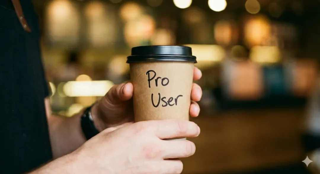
Hand texture, skin tone, blood color are all fairly natural, no “3D wax hand” horror feel. “Pro User” on the cup is three letters, clear, spelled completely correctly, font is typical marker hand-written style, highly matching the overall vibe. Background is soft bokeh and light spots, blurry figures, warm yellow lighting — just like a casual Instagram shot at a corner café.
Conclusion: For lifestyle / social media visuals / brand soft placement, Nanobanana Pro has moved past “toy feel,” especially short text control is way more stable than many older models — two or three English words basically won’t crash.
Test 04 · Rainy Night Cyberpunk Street
Prompt: Rainy night cyberpunk street, giant neon sign reading “NANOBANANA,” pink, road reflections, cinematic feel, 8K texture.
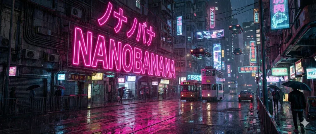
First glance is movie storyboard: deep blue street washed into a whole color fog by magenta neon, air full of water vapor and particles. The “NANOBANANA” big sign delivers, letters neat, contours clear, edges with natural glow bleed — the kind of neon quality you’d see on cinema screens. Scene also has trams, umbrellas, vehicles, various Japanese signage, distant buildings layered, road puddles reflecting neon into bright lines.
Conclusion: Complex city scenes + atmosphere rendering is one of Nanobanana Pro’s strengths. If you’re doing cyberpunk, future cities, neon long streets, it can basically give you a “already color-graded” version first try.
Quick summary of text-to-image section: · Composition leans “safe but premium” — magazine cover level composition without much manual pushing; · Realistic scenes have clear advantages in lighting, texture, and detail; · Short text control has reached the point where you can confidently use large fonts — very designer-friendly.
03
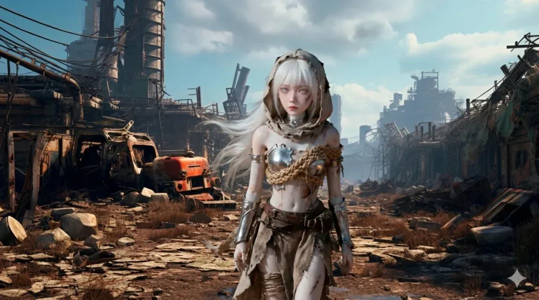
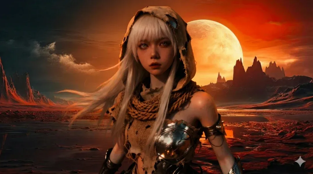
Wasteland Girl Image-to-Image: Character Memory & 4K Wallpaper Experience
The previous images were all “its own imagination.” What really determines workflow viability is image-to-image capability — especially for those with IP characters or OC designs: “I already have a wasteland girl, can I stably place her in different scenes?”
Test Setup · Two Rounds of Image-to-Image
Instructions I gave the model, basically two rounds:
- Round 1: Reference image A (wasteland girl), reference image B (desert wasteland scene), prompt: “Reference these two images, integrate the character into the scene.”
- Round 2: New scene with sunset planet feel + same character, prompt additionally emphasized: “Desktop wallpaper size, 4K ultra-clear.”
Observation 01 · Character Consistency
White hair, hood, bandages, metal armor — all key features preserved well, face shape and vibe basically continue from original, no sudden face-swapping or becoming a different character. This matters a lot for those wanting to build long-term IPs — character won’t suddenly “dissociate” just because the background changed.
Observation 02 · Lighting Match & Materials
Background is strong side-light + blue sky wasteland scene, character’s highlights and shadow directions basically align — doesn’t look like a PNG pasted on. Torn cloth, rope, metal armor, belts all have scratches, wear, dust, overall leaning 3D render + realistic style, detail-rich but not over-sharpened.
Observation 03 · Composition & “4K Wallpaper” Understanding
Generated image is widescreen composition, character centered slightly toward foreground, both sides given plenty of environment detail and whitespace, sky, distant buildings, dust-flying ground all have rich information. Looks great even on ultrawide monitors, definitely at “can immediately use as desktop wallpaper” level.
Image-to-Image Conclusion
For IP characters, Nanobanana Pro has several practical implications:
-
You can relatively worry-free produce a whole set of worldview posters / wallpapers, character won’t drift.
-
Merchandise main visuals can use it as base, then hand to artists for fine-tuning, rather than starting from blank canvas.
-
Same OC in different worldview backgrounds (wasteland, planet, cyber city), it can deliver relatively coherent visual language.
-
I haven’t tested its legendary 14-image reference explosion capability yet!
In other words, it’s no longer a model just for “casual play,” but a tool that can truly participate in character operations and worldview building.
04
Summary & Usage Tips: Where Should It Be Used?
Putting the test groups together, I’d define Nanobanana Pro as: “A versatile workhorse that can actually get things done, not a flashy toy.” But as a rational INTJ, let’s still break down its strengths and caveats clearly.
Clear Strengths · Where It Shines
-
Wide style coverage: Fashion covers, realistic photography, macro, cyberpunk, 3D wasteland — all deliverable with stable quality.
-
Excellent large text performance: “设计,” “DESIGN,” “Pro User,” “NANOBANANA” — all large text correct, poster and cover level drafts usable.
-
Strong detail control: Beetle water droplets, metal reflections, cloth fibers, road reflections — all highly finished, won’t blur into mush.
-
Stable image-to-image characters: Found balance between character memory and scene matching, faces don’t collapse easily, also won’t completely ignore background lighting.
-
Quickly produces “usable reference drafts”: Great as a rough/refined sketch generator for designers, illustrators, and content teams, accelerating the 0 to 0.7 phase.
Minor Gaps & Usage Tips · Mind the Gaps
- Small text still unreliable:
Small English captions on covers look like real copy but are often made-up words — for actual production projects, re-typeset text yourself.
- Default composition is conservative:
For more aggressive angles (extreme low angle, super close-up, strong perspective), you need to explicitly emphasize in prompt, otherwise it gives you “pretty but safe” composition.
- Series images should be generated in same round:
If doing a whole campaign set, try to generate in same session with same style description for more unified tones and textures.
- Don’t expect it to replace taste:
It’s great at “expanding possibility space,” but the final step of “is this image the flavor I want” — that decision is still yours.
If you already know design, photography, or concept art, Nanobanana Pro can pull your ideas from 0 to 0.7; that remaining 0.3 is your own aesthetics, judgment, and post-processing.
This can be considered a “first hands-on review” — if you want to try architecture, graphic advertising, UI, and more directions later, it’s definitely worth another “advanced practical article.”
Mr. Guo’s Indie Dev & Growth Notes
AI Creation / Strategy / SaaS / Global Growth
“Good tools won’t think for you, but they give you more time to think about what truly matters.”
If this hands-on review inspired you, drop a 👍 and share it with more creators exploring image model capabilities through firsthand experience.